TAP into creativity 🎭🎨
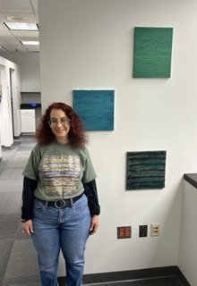
This month we are featuring poet and mixed media artist Laura Rae. Read on and discover her passion for art and creativity.
FIA: Describe your art medium and how it began.
LR: Before I became an artist, I was an award-winning published poet. In 2013, I felt as if I had reached a plateau. I felt as if I had said everything that I had to say as a poet, and I wanted to try something new.
I decided to try my hand at creating abstract artwork. I began by using acrylic. I have also utilized candle wax and colored sand from time to time, but acrylics are my preference.
In November of 2013, I created five pieces of artwork. I submitted exhibition proposals to the libraries for the towns where I graduated high school and college a month later. Both libraries responded by sending me a contract.
My first exhibit began in late December of 2013, and I have been creating, publishing, and exhibiting my work ever since.
I have used and utilized various mediums over the course of my artistic career. I therefore tend to refer to my work as “abstract fusion.”
In the spring of 2019, I created and published a chapbook of my work. It featured thirty-eight pieces of original abstract artwork, and I called it “fusion”.
FIA: Tell us more about the tools and supplies used in your work.
LR: I typically mix my paint in a cup and use a spoon to stir. I will then either pour the paint onto the canvas directly or use the spoon to place it exactly where I want it to be.
I used to use a brush to paint from there but now I paint with a balloon. The brush is only used for the sides of the canvas and touch ups right now.
FIA: Is any of your work on view to the public?
LR: I am a member of an art league, and we have a permanent group exhibit on display at the Centralia Animal Hospital in Chester. Three of my pieces are being shown there, and they are also available for purchase. More of my work will be on view and up for sale from July 1st to the end of the year at Crossroads in Richmond, Virginia.
FIA: What is your first finished piece or project you can remember and how did you feel about it?
LR: The first piece that I ever created was of an erupting volcano, and that is what I called it. It was done with acrylics on canvas. It was featured in exhibits that were held in Connecticut, Massachusetts and Maine, and it currently belongs to a former cafe owner in Maine.
{FIA}: What motivates you in your work? What draws you to ideas?
LR: I motivated to create work that is based upon my thoughts, feelings, and areas of interest.
For example, my 75th exhibit was held at the Envision Art Gallery in Kansas from the beginning of January to the end of February in 2024. I created abstract representations of gemstones and their inclusions.
An inclusion refers to anything from fractures to color changes to twining, which is the term used for when two gemstones grow together. Such phenomenon can occur either naturally, from erosion or via interference of some kind.
The exhibit was called “inclusions“, and it was very well received.
FIA: Describe your process when beginning a new project or piece, for example, journaling or planning.
LR: I tend to begin by developing the overall concept for a project first and from a rather practical standpoint. I consider the color schemes, canvas dimensions, and possible themes that I’ll be working with. If my work is about to be featured in a new venue, I’ll try to obtain wall space dimensions before creating new pieces.
The creative process can then begin. I’ll create new pieces with the acquired information in mind. I may or may not incorporate pieces that I’ve already created, and I’ll determine the layout for my work as I go.
There have also been moments when there simply isn’t enough time to create a series of new pieces. For those exhibition opportunities, I’ll choose what I feel are the best pieces for that venue and have a layout in mind.
FIA: Who are the artists you admire?
LR: I admire Claude Monet’s dedication to his artistic career, even while navigating through vision loss. I also enjoy his aesthetic immensely. Vincent Van Gough and Jackson Pollock are two of my other favorite artists.
FIA: What is the most oddly interesting item in your studio and why?
LR: I have a lovely blank journal in my studio. It’s hard cover and has a gold-colored tree of life on the front. I use it to plan out my exhibits and creative ventures. My thoughts and ideas seem to flow rather freely every time I use it.
FIA: Do you listen to music while you work? If yes, what would your playlist include?
LR: Sometimes I’m in the mood to listen to music while I paint. Other times, I prefer to have the Food Network or a Hallmark movie on in the background.
If I listen to music, I find myself listening to either soft rock or classic rock.
FIA: What are you most proud of?
LR: I’ve determined that there isn’t just one single moment in my life that I’m proud of; there are many. Every time I begin to work on a goal or dream, I feel fulfilled.
Creating and sharing my work is one of the ways in which I express my voice and vision. I find it fulfilling, and I hope that my creativity inspires others to reach for the stars and accomplish their dreams.
FIA: What do you still want to accomplish?
LR: My work has been exhibited in ten different states, and I’d love to have it shown in more. I also think that an agent and corporate sponsor would aid me greatly in sharing my work and my vision with others.
FIA: What would you say are the key themes of your work?
LR: I typically paint that which I think, feel, and am otherwise interested in.
For example, I had an exhibit at the Chester Public Library from April 27th through June 27th of this year. It was called “inspirations,” and that’s exactly what it depicted. I abstractly repressed that which I find I find inspiring, and the show was very well received.
FIA: Why is it important to create? How does being creative influence your life and those close to you?
LR: Creating and sharing my work is one of the ways in which I express my voice and vision. I find it fulfilling, and I hope that my creativity inspires others.
FIA: How do you think your art informs or influences others?
LR: I believe that inclusion and inclusivity are important. As such, I create sensory and tactile artwork for children and the blind population. This provides an opportunity for those who haven’t experienced the world of art before with a chance to do so.
FIA: What was the moment you felt this really happening and you felt your art was being noticed and appreciated?
LR: In April of 2016, thirty-six pieces of my artwork were on display in a bar in Richmond. Bacardi sponsored the exhibit, and four pieces sold during opening weekend.
The pieces that sold featured an original published poem in the center of the canvas with candle wax artistically melted around each poem.
FIA: Give us one fun fact or event that made it all worthwhile. the inspiration for a piece of your work, an encounter with an artist you admire or an appreciator of your work, etc. What makes it all worthwhile?
LR: In 2015, I began creating tactile art. I exhibited these pieces at children’s museums in Texas and Iowa. My work helped boost creative interest and
Do My very 1st art exhibit was held at the Haverhill Public Library in Massachusetts. It began in late December of 2013, and I was told that it was well received.
Now, I’m on the precipice of displaying my work for the 100th time. The Haverhill Public Library has agreed to be the venue. We’re all extremely excited about this, and the exhibition is tentatively earmarked for some time next spring.
Laura, we wish you the best as you continue to expand your collection and increase your artistic vision.
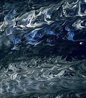
The image shows an abstract, textured composition with a marbled or fluid appearance. It features swirling patterns in predominantly blue, white, and gray tones. The texture resembles liquid or paint that has been mixed together, creating organic, flowing lines and ripples throughout. The patterns have a dynamic, wave-like quality with lighter and darker areas creating depth and movement. The overall effect is reminiscent of ocean waves, marble surfaces, or fluid art techniques where different colored liquids are swirled together to create intricate, natural-looking patterns. The image has a moody, atmospheric quality.
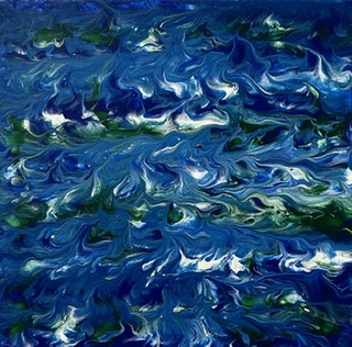
The image shows an abstract painting with a predominantly blue color palette. The artwork features thick, textured brushstrokes in various shades of blue, ranging from deep navy to lighter azure tones. White highlights are scattered throughout, creating a sense of movement and light. The painting has an impressionistic quality, with the brushwork creating a dynamic, possibly water-like or sky-like appearance. The strokes are applied in a loose, expressive manner, giving the piece an energetic and fluid feel.
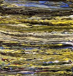
The image shows an abstract artwork with horizontal bands of color and texture. The composition consists of wavy, flowing horizontal lines that create a layered effect throughout the piece. The color palette includes yellows, golds, greens, blues, whites, and dark browns or blacks. The brushstrokes or marks appear fluid and organic, creating a sense of movement across the canvas from left to right. The layers overlap and blend into each other, giving the piece a dynamic, almost liquid quality. The overall effect is reminiscent of stratified geological formations, water reflections, or an abstract landscape.
Discover more from Friends in Art
Subscribe to get the latest posts sent to your email.